Wednesday, 2 September 2009

Water drop shots

_DSC2269b

Had a terrible week and I needed something to take my mind off things, so I thought I’d try some water drop shots.  After about 300 shots I had at least three that I liked.  I quite like the shot above because it’s not clear that the whole cd is under water, and it’s like the music is exploding from within, well at least that’s how I see it.

The other two are…

_DSC2276

_DSC1931

These are processed way more contrasty than my normal stuff but it' seemed to suit the pics.

Cheers
Ian

Wednesday, 26 August 2009

Shady shooting!

_DSC1745

Just a quick post about shooting outside on bright days. If you’re already into photography then this is old news to you :)  but I thought these images illustrated the point quite nicely so hopefully someone somewhere might find it useful :)

As you can see the above shot was taken on a really bright sunny day.  I wanted to use the hedges to frame Stacey and I wanted the path to be the background but this meant I had to deal with a very harsh sidelight.  I quite often hear people saying that ‘natural’ light is the best light, but that’s not strictly true.  I think what they usually mean is that window light is a nice light.  It’s nice because it’s a large lightsource compared to the subject and so the light hits the subject from wider angles and therefore wraps around the subjects contours giving a very pleasing transition from light to shadow.

If you put someone beside a tiny wee window then it definitely wouldn’t be as nice :)  It’d look a bit like the picture above, because the light would be relatively small and so would be very hard, making a sharp transition from light to shadow.  The same thing is happening above because the sun, while bloody huge, is relatively small because it’s far away.  If it was a cloudy day then the cloud cover acts like a large soft diffuser and gives a much more even light, but on this day the sky was clear blue.

So the solution was to move Stacey back a bit to one of the shadier areas where she wouldn’t be in the direct sunlight…

_DSC1748

So while this sorted the high contrast problem we now had Stacey standing in the dark.  So this is where the softbox came in.  Sometimes I can use three or four lights but in this instance one was easily enough.  The softbox made the light a bit bigger and therefore a bit softer for the reasons I mentioned above. For the pic below Leah was standing on her tip toes holding the softbox high and pointing down towards Stacey.

_DSC1753

This is the reason you quite often see a photographer using a flash on a sunny day.  It allows you to light on two different levels, one is your background (or anything that’s lit by the ambient light) and the second is your flash.  Of course I was limited by the power of the flash I was using and by my choice of aperture.  I’d ideally liked to have blurred the background a tad more by using a larger aperture but because I wanted to use the flash I was limited to my flash sync shutter speed of 1/250th so I shot this at f4, ISO 200.

Anyway, must also say a bit thanks to Houston House Hotel for letting us use their lovely grounds :)

Cheers
Ian

ps… fashion!

hps-fashion242 

I’ve been so busy processing wedding images last week that I’ve not really had time to update this blog for a bit so I thought I’d put up a wee post about a great fashion shoot we did on Monday. 

It was for a new ‘lifestyle’ supplement to go with Home Plus Scotland magazine called ‘ps…’  It’s the first time we’ve done anything like this and we didn’t want to go down the route of just requesting PR images because you see the same images floating around other publications so we decided to go and do our own shoots. 

However, the organising that goes into something like this is incredible and as we are producing Home Plus at the same time (as well as a few other mags!!) and because a couple of larger clothes chains let us down (you know who you are) we had to scale our plans back a bit.  BUT, Leah did an amazing job of sourcing some really beautiful clothes and I think we have some fantastic images. 

_DSC1700

Have to say a huge thanks also to our model Stacey who was just brilliant, very natural and had so many different looks and poses she was so easy to work with (book her for your shoots now!"),  and to Jade our make-up artist who gave us some really beautiful looks to compliment the clothes, to Leah who was an excellent stylist and to Duncan, who owns the studio and also help out with lighting…(ahem)

hps-fashion016

For the studio lighting we used a grey seamless paper background, one softbox camera right as the key light and one softbox behind Stacey feathered off to the edge of the background to give a bit of a gradient effect.  We also had a slaved light underneath the key light through a brolly to get more light onto Stacey’s legs to show the tights and shoes up a bit more.

I was also shooting tethered to my laptop so everyone could see the images as they were shot, and looking at the laptop screen is such an improvement on looking at the back of the camera, it makes it easier to see how the lighting etc is working.

For the outdoors lighting I used one flash only through a 60x60 softbox, handheld by Leah.  It was such a bright day that we had to find some shade.  Going to post an example of using shade in another post :)

I don’t want to post loads of pics before the magazine comes out so I’ll only post two more which just so happen to be two of my faves (apart from the shot above of course!)

hps-fashion075

_DSC1744b

I love these shots, the one directly above was actually an outtake as I was taking ‘walking’ pictures and for some reason totally missed my framing on the last shot.  It’s not a great shot to show off the clothes but I still love it for Stacey’s expression, and the framing of the leaves just seems to work.  Although, I have to admit the leaves were quite a bit greener than they are here, I changed the green to a more autumnal colour to match the clothes, and the fact that this ‘ps…’ will be the Autumn/Winter edition :)  Anyway, this one might make a nice cover!

Really enjoyed this shoot and I think I’ll definitely look into doing some more fashion work.

Look out for ‘ps…’’ around Scotland as a free pick-up A5 mag end of next month, after that it’ll be bagged up with the next edition of HPS!

Cheers
Ian :)

Thursday, 13 August 2009

Home Plus Scotland

hps_blog-cover

We received Home Plus Scotland back from the printers today.  Our last couple of issues had a few colour problems so we were using a new printers.  You never quite know what you’re going to get back the first time but we were really impressed with the colour, clarity and sharpness of it.  I’m particularly chuffed because I had the cover this issue and a couple of house shoots, and also a wee feature on my blog, and it’s all come out looking fantastic.  If you’re passing a newsagents or a WH Smith you should definitely pick up a copy. 

I really think the magazine is going from strength to strength and it’s just looking so good now, very fresh design and a good balance between interesting features and product pages.  Also, next issue there will be an a5 lifestyle supplement called ‘ps…' bundled with it (as well as going out on it’s own for a month(ish) beforehand).  I’m going to be doing two fashion shoots, one studio and one on location so I’m really looking forward to it.  We have two great models lined up and the clothes etc have started coming in for it and I’ve picked up my grey background paper :)  I think it’ll be a really cool wee supplement.

Anyway, here’s a couple other tear sheets from this issue, this one is from the shoot with Lyken and I think the black really suits it,

hps_blog_2

The next is from the same shoot as the cover.  The colours are a bit subdued here but in the magazine it’s much more vibrant.  I think it’s to do with the pdf I made of it.

hps_blog_1

This one is from a house in Fife that we did.  Worked with a really good stylist (Ali McCulloch) on this one and she dressed up the table really well, it made all the difference.

hps_blog_3

Last but not least is the blog watch feature.  It’s now a regular feature we run and it’s a great idea by the editor to highlight different design type blogs.  This issue she wanted to highlight mine since it’s linked in with the magazine and the Home Plus Scotland website will be up soon too so I’ll be linking to that.  Took some persuading as there’s many many many better blogs out there but I’m still quite happy with how it came out, apart from the picture of the ugly bloke!

hps_blog_4

Anyway, if anyone wants a glossy mag to read I’d definitely recommend HPS and not just because I’m involved with it, I really do think it’s a great mag :)  I’ll blog up about the fashion shoots too, they’re coming up in the next few weeks.  Also going to try some new food shots for HPS which will be fun.  Oh and I have a wedding to shoot this weekend!

Cheers
Ian :)

Saturday, 1 August 2009

Lykenography

_DSC0844

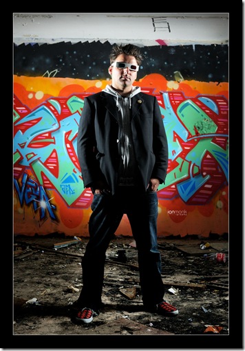
Had a great shoot with a really cool artist up in Dundee on friday.  I was taking the picture for a piece that Home Plus Scotland magazine are running on Lyken, an artist who has a background in graffiti (no pun intended lol).  While Lyken’s weapon of choice these days is canvas he’s still involved with the graffiti scene.  He’s away to Belfast this weekend to take part in an organised cross community event on the Shankill Road.

Usually when a graffiti artist gets their picture taken they have their faces covered for obvious reasons, and while Lyken’s creations are all legal he still likes to do something a bit quirky as a kind of nod to this tradition.  Hence the cool 3d glasses :)  He also wears them because he doesn’t take himself too seriously which is something I can totally identify with!!

The main graffiti on all three walls on these pics are Lyken’s work and they look great, it’s such a cool location.  The shot above wasn’t meant as a set-up shot as I actually wanted the lights in the frame but it also shows off the place quite well, and I think it’s quite a cool shot :)  It’s obviously a three flash setup.  The third is on the floor behind Lyken pointed at the wall.

As well as his 3d glasses he has this really smart belt buckle that’s in the shape of his name.  I saw it on a picture that he’d sent to us and I knew I wanted to do something with it.  After a couple of test shots I realised we’d have to light the reflection rather than light the silver itself.  So I pointed the softbox at the bright orange and green graffiti you can see behind Lyken on the shot above and had him stand sideways to it…
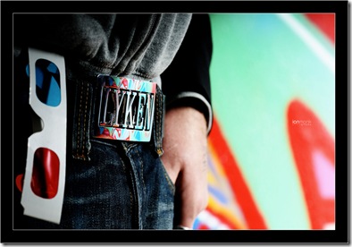
_DSC0801

I love this shot.  Like my last post about taking detail shots in house shoots and how that can give you more of a flavour of the house than an all-encompassing 10mm wide shot can, this shot for me says it all.  You don’t need his face in the frame :)

Another shot I thought turned out well was this one…
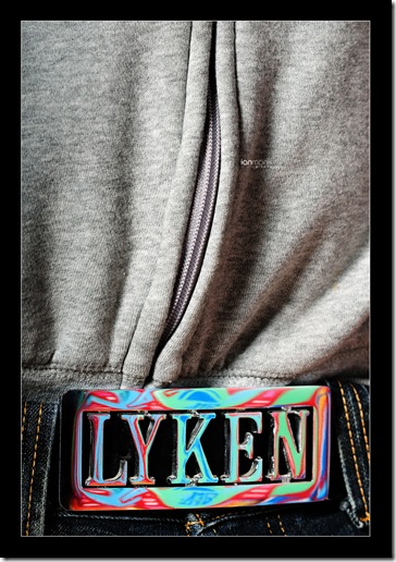
_DSC0795

But as Lyken pointed out it’s not clear that the colours are a reflection.  It almost looks like a psychedelic buckle.   If I’m honest, I’d wear one like that but he has much better taste than me :)

This next shot is one I took specifically with a double page spread (DPS) in mind…

_DSC0771

The piece is going to be two pages and I knew we’d have some nice colourful backgrounds so the idea was to try and get a possible full dps background shot.  The orange is pretty bright though so there would have to be either a dark gradient added or a faded black box over most of the right hand page.  Might not run like that but regardless, I really like this shot.  It’s a two light shot with the softbox off to camera right and a bare flash just out of frame camera right really close to the wall.  Once Home Plus is out I’ll post up a tear sheet.

I wanted the texture of the wall to show so I had it raking across the wall at an extreme angle.  I thought about using the snoot like I’ve done before with graffiti but it would have been too extreme as I didn’t have much working room.  Looking at it now though I wish I’d tried a tight beam shooting up from the bottom right corner.  Next time :)

Next shot I wanted was one of Lyken standing against the wall with a hard light projecting his shadow over his artwork.  I decided I’d use some on-axis fill since Mr Hobby himself has been really talking this up recently.  I set up the shot without the fill first to get the shadow right…

_DSC0806

This is just one flash obviously off to camera right.  I actually really like this shot without the fill light in it but once I added the fill light it just brought out the colours…
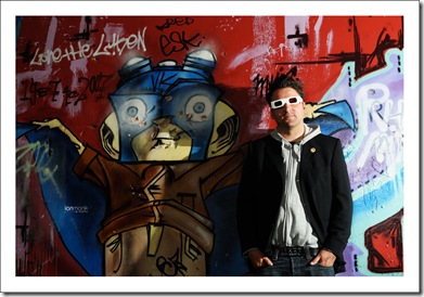
_DSC0808

I’d be really interested in hearing other opinions about these shots.  I like both and can’t make up my mind which is better.  Perhaps I went ott with the fill and somewhere in between?  Anyway, the fill is the softbox right above me.  I was half crouching underneath it.

The last option I wanted to give the mag was a lighting setup I’ve seen used quite often for sportsmen.  Basically it’s just two lights, one at either side of the subject (setup same as the first pic posted).  I added a third to the background…

_DSC0838

Again, pretty happy with this shot.  I had thought I might need a reflector for a bit of fill in front but I was happy without it.  Interestingly, the background light was my vivitar 285 which occasionally doesn’t fire and I got a couple of shots without light on the background which I kinda like…
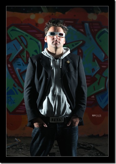
_DSC0837

Again, I’d love to hear any opinions on which one people prefer.  I like both!  The one without the background light makes me think it’s been taken in a street somewhere with streetlights on either side.  No idea why!

Here’s a full length version I took of this same setup which we thought looked like something out of ‘Heroes’ :)  I think it’s a cool pose and the floor looks great.  It’s just that white strip at the top that slightly bothers me.
_DSC0840b

Lastly I took a couple of shots at the end while experimenting with the lights…

_DSC0863

For this shot I had three flashes set up.  A bare flash just out of frame camera left but pointed right at the lens for a bit of flare (most of which I took out in post doh!) and highlights on his hair, and the softbox also cam left but obviously in front of Lyken.  The third was pointed at the background and it also bounced a little fill back to the shadow side.

The last shot was a similar setup but without the flare.

_DSC0875

The shoot was good fun and Lyken’s a great guy so hopefully will shoot him again in the future.  I’m also uploading these to my flickr so if anyone’s interested they can probably see them bigger there.

Cheers
Ian :)
Sunday, 26 July 2009

The angels in the detail!

_DSC0414

Had a really good house shoot in Glasgow last week for Home Plus Scotland magazine.  The owners are setting up their own interior design and painter & decorators company (Re-decorate) and they certainly have tons of past experience to draw on.  Their home was beautiful with quite a few quirky interesting things to photograph and they made me very welcome too.

The shot above was the main living room and I popped a flash up on a stand just out of the frame camera left to even out the exposure a bit.  I felt that a more flat, even lighting worked best for this room since it was quite ‘deep’ in the sense that the window light fell off a fair bit before it hit the back wall.  A tripod and longer exposure coupled with the flash evened it out nicely.

Another shot I really liked the lighting on…

_DSC0421

This one was just natural light.  I did try a touch of flash off to camera right bouncing off the ceiling but it just didn’t need it and I really liked the soft shadows that big window was giving.

This room really was a huge space which I hope comes through on the images.  The piano was quite substantial but even that looked right at home.  I can see why Karlyn & Rob say this is a great party room!

_DSC0439 

Yet again I left a house being jealous of the kitchen :) 

_DSC0453

I have a few more pics than normal to post because I took quite a few detail shots.  I always start a shoot with wide angle shots of the rooms and while it still requires alot of thought about composition and whether to light or not, it’s still the detail shots that give you a flavour of what a house, or indeed it’s owners, are really like.

For most of the time I use the 50mm f1.8 lens for the details since it gives me the ability to get really good quality shots at f2.8 and so allows you to be a bit more creative.  I occasionally use my beloved 150mm macro lens but that’s often a bit overkill for what I want.

Here’s a few detail shots that I thought were cool…

_DSC0488

The next two shots below are a perfect example of detail shots that give you a flavour of the place and it’s owners.  Karlyn & Rob are creative types and these details of their office space show that I think…

_DSC0501

_DSC0510

This next shot also shows that they are slightly mental.  It’s an old family heirloom I think and yes, it’s real.  It just seems to work in that room though!

_DSC0517

This next shot shows a nice cross section of the colours in the diningroom/kitchen…

_DSC0523

Another quirky shot which I love.  This was a hole where an old plug socket used to be so they’ve added a wee door with a ‘home sweet home’ sign on it for the mice…of course!

_DSC0533

Another thing I like about the detail shots is the ability to compose a shot that’s a ‘slice’ of a room.  This last shot was one I saw while doing the wide shots but it really needed a closer perspective to get a nice shot out of it.  I’m really happy with it because of the colours, the composition and the lovely natural light.

_DSC0537 

Not too much lighting info in this post since the house was nice and light with not too much contrast to worry about but I got to talk about how important I think detail shots are so it’s all good.  Perhaps I’ll get a lot of my previous detail shots together and do a single post about them.  That’s for another night :)

Cheers
Ian :)

Saturday, 25 July 2009

Background check…

_DSC0701

I decided to experiment a bit with backdrops last night.  I really believe that the background of a picture is every bit as important as the foreground, so I wanted to take a few test shots to test out some ideas I had.  The shot above is a test shot I’ve been meaning to try for a while.  I don’t have a light-tent but I wanted to mimic a seamless backdrop, so I taped together three pieces of A3 white paper and taped them up over my monitor (setup shot below).

_DSC0561

You can see in the setup shot that I had the softbox really close to the subject.  This effectively made the softbox as large a light as I could which made the shadows as soft as possible (since the light is hitting the subject from many different angles).  On the milk shot at the top of the post I also had another flash off to camera left with a snoot on it to direct the light in a tight beam.  I didn’t want a pure white backdrop in that shot and so aimed the snooted flash off to the side for a gradient of white to grey.  

In order to get this gradient it meant I also had to position the softbox very close to the subject and pointing directly at it from the right.  I also pointed it slightly away from the background as I didn’t want the softbox to just nuke all the paper to white.  It’s very tricky to get enough separation between subject and backdrop in such a confined area but I managed it.  I possibly could have used a smaller softbox or just shot the flash through some white paper, but I wanted to get as soft a shadow as I could.

Here’s a couple more shots of the chocolate brownies…

_DSC0567

_DSC0560

_DSC0563

The next background I wanted to try was to create a nice bokeh effect with some nice highlights.  Since my son and I found the Pixar Cars short films (Mater’s Tall Tales) the other day and he thinks Mater is great I thought he’d like a few pics of him.  I now have this next shot as my desktop…

_DSC0744

Here’s a kind of setup shot which shows how I made the background much more eloquently than I could explain it…

_DSC0747

Yes the glasses where all fingermarks but I had just been using them to pour milk into :)

This was just a flash with a green gel and a grid.  I only used the grid to control any spill of light onto the wall but when I saw how out of focus the background was I realised the grid probably didn’t matter that much.  I’d ideally like to have taken the flash further away to reduce the large highlights but as I had to climb over two chairs to get to it (and one of those having the cars on it) I decided it was fine as it was :)

I had to use my 150mm macro lens not because of the macro function but because of the perspective.  Obviously when you use a longer focal length your perspective is narrower, and so I only needed the three glasses.  I tried the 50mm first but I think I would have needed about 15 glasses to fill the background :)

Here’s a couple more I liked…

_DSC0717

_DSC0752

I have another couple of ideas I’d like to try out on a black seamless so I’ll try that soon and post up.

Cheers
Ian