Thursday 30 April 2009

I want that kitchen!

_DSC8319

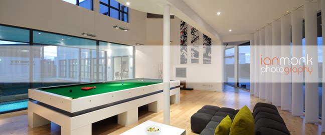
I did a house shoot for Home Plus Scotland (HPS) the other day and I couldn’t believe my luck when I saw the kitchen.  It was just so spacious and, like the rest of the house, beautiful!  This has to be one of my fave kitchens so far from all the ones I’ve snapped.

It was quite a bright day and so the sun has burned away some of the detail in the above shot.  The table in particular has suffered even though I was careful with the exposure so as not to nuke the floor.  Still, in an ideal world I would have had an extra hour (or ten!) to set up some flashes to light the interior.

However, I only had two hours to get round the whole house and so I didn’t really have time to set up flashes etc.  I’m still quite happy with the natural light though and as this is going into the Summer issue of HPS I thought a bit of bright sun would fit the bill nicely.

Here’s a couple more shots…

_DSC8308

I was a bit worried about the top of the bath burning out but there’s actually plenty of detail left in it.  A great reason to always shoot RAW, there’s so much more detail left in the files even when you think it’s burned out.

_DSC8236

_DSC8353

This one looks quite nice in black & white but unfortunately black & white is quite hard to fit into an otherwise colour editorial layout.  I think you need to have a black & white theme in the article for it to work.  Strange really, but one black & white shot in an article full of colour shots just doesn’t look right to me.

_DSC8358

Rather like this wee detail shot.  The owners like their animals and there were a couple of these beautiful brown leather chairs around so I thought this gave a nice ‘flavour’ of the house and its owners.

Had another shoot today in a really cool house but off on hols over the weekend so wont process the pics until next week.

Hope anyone reading this has a nice holiday weekend too.
Cheers
Ian

Monday 27 April 2009

Group Shoot!

_DSC8151

Well we had another fun group shoot on Sunday thanks to Tom and everyone else who came along.  Tom had found a cool location and I think we got a lot of great shots out of it.  I think it’d be a great place for a car shoot but unfortunately we’d need a helicopter to get it in there :(

So here’s a few of my shots from the day and I’ll try to get a link or a copy of the group shot as it was cool :)

One more big thanks to everyone who came along, in particular Kayleigh and Charlie who braved the broken glass and dead birds to make some really great pictures.

Cheers
Ian

Saturday 25 April 2009

Post Processing

_DSC6935

Been meaning to put up this post for a while since I’ve been asked on Flickr by a few people about a Post Processing technique I’ve been using a lot for portraits.

The picture above has been processed using a black & white layer technique that just seems to work for certain pictures.  It’s quite a basic technique and so anyone can try it as long as they understand how to use layers in photoshop.

I basically start with my TIFF file which has been converted from my RAW, then I duplicate the layer and create a black & white version of it.  I find that a slightly more contrasty version works best.  Then I change the layer’s blending mode to ‘soft light’.  ‘Overlay’ can work if you want a much stronger effect but I prefer the ‘soft light’ mode. I then usually lower the opacity a touch until the image looks good

I like the de-saturated look and the almost cinematic ‘feel’ it gives a portrait image.  It also tends to work if there’s some slightly over-exposed skin which can be quite complimentary in a portrait.  It definitely doesn’t work on all images but it’s just another handy tool!

For comparison here’s the same image but with a ‘normal’ post process applied…

_DSC6935norm

I always end up de-saturating portraits as, even in the ‘Neutral’ or ‘Portrait’  settings my D300 is still a bit strong on the colours.

Cheers
Ian

Wednesday 15 April 2009

New website finally

new website

I’m in no way shape or form a web designer.  I have problems doing this blog sometimes!!  ALWAYS forget to change the font before I post.  Anyway, I thought this was blog worthy because I’ve not only finally got my revamped website up but I’ve also linked in this blog.  I like the idea of having a frequently updated element to a website which itself might only be updated once or twice a month with new pics etc.

So follow this link to see the wonders of my website design :)  Oh aye and I’ve also emailed Zack Arias about a critique since I’ve applied what I’ve learned from watching his critique videos, although he must have thousands of similar emails so I wont hold my breath, but if anyone else has any comments whatsoever they would be mucho appreciated.

Cheers
Ian

[edit] font DOH!

location location loc…in print.

tbeastie-layout

Just a wee post as our mag comes back from the printers tomorrow so I’m ok to post this now, I’m sure the editor Leah wont mind me jumping the gun a bit.  I thought, since I blogged about this portrait at the time I would put up the actual page.  I’m quite chuffed at how it’s turned out, Paul and Leah have done a good job of the layout.

Was wondering the other day if I now automatically compose pics for editorial use.  I like negative space and it fits in with rule of thirds and all that, but I don’t want to end up taking the same compositions all the time.

I suppose we all fall into ruts from time to time!

Cheers
Ian

The Flashy Pad…

flashnotworked1

Whoops, a few very busy weeks have got in the way of the blog, tut tut.  Anyway, I had meant to post this as a wee follow up to my previous post.  The image above is one of those where I prefer the natural light blowing out the windows.  This is partly due to the view being a mix between a building site and views of a rival house builder’s development ;)  It’s also partly due to the cool looking lights in this room.  I liked the reflections I was getting but if I used a faster shutter speed to get the views outside in I lost the nice reflections and the warmth that the lamps gave the room.  You can see this in the pic below…

flashnotworked2 

While the sky looks nice the room looks colder and not as inviting.  The lamps and main light are still on but the exposure is for the outside, while I have 2 flashes lighting the interior.  I also had problems with even coverage, partly due to the configuration of the room and partly due to the colour of the walls.  Had they been white then it would have been easier to get an even bounced light.  Still, I much prefered the natural light shot.

In the following pics I was faced with a brightly sunlit room on one side and a dark en-suite bathroom on the other. There were also bright ‘stripes’ across the bed and walls that burned out when I exposed for the room in general.  I used 2 flashes in opposite corners of the room so I could use a faster shutter speed and to stop the sunlight burning out detail in the  bed.  I then had to stick the vivitar 285 in the bathroom to bring it up to the same level.

First, 2 flashes behind the cam into the roof joints, and a balanced exposure to retain detail in the sun lit areas…

2flash

Then with a flash in the bathroom…

3flash

And finally a wee shot showing again how you can bring in the sky.  This one looks like a photoshop gradient but it isn’t, it’s just one exposure using 3 flashes…

3flashb

Cheers
Ian

Saturday 4 April 2009

The Flashy Pad continued…

flashy pad1

I had a job a couple of weeks ago for one of my house builder clients to photograph some showhouses for them.  It was a lovely sunny day which is great for the beach, but obviously not so great for photography.  I had sun streaming in from the windows producing high contrast scenes everywhere.  Of course it looks great to the naked eye, but if only they could make a camera with the same dynamic range as a human eye!!

Anyway, I resorted to using my flashes as I usually do in these situations.  As you can see from the left image above, which was taken with just natural light, the sunlight was causing me to get burned out highlights in the floor and had a blue cast since I was using auto white balance (shooting RAW of course!).  The image on the right was created using three flashes: 1 hand held behind me bouncing into the roof, a second in a stand in the kitchen pointing backwards again bouncing into the roof joint and a third in the living room at the end of the hall bouncing into the wall.

The image on the left was 1/5s at f8 while the right hand one with the flashes was 1/60th at f8.  Using a 60th of a sec shutter speed meant that the hall light didn’t really register which is why I cut it out of the composition.

Here’s another flashy pad pic…

flashy pad2

This one is a matter of preference I think.  I prefer the image on the right as I think it shows the colour of the floor and cabinets more accurately, but the one on the left isn’t without it’s merits.  I also wanted to bring in the blue sky and so basically exposing for the outside and lighting the interior with the flashes enabled me to do just that.  I think I only used one flash in the kitchen, bounced off the wall of course.  Bouncing off a wall turns the wall into the light source and so, since it’s a (relatively) bigger light source, it’s a softer light source therefore giving softer shadows.

flashy pad3

Again, a matter of preference.  Sometimes overpowering the ambient can take away some of the warmth of an image.  I almost lean towards the natural light version of this one but I’m not sure why.  Perhaps it’s because it’s a livingroom and the streaming sun looks more inviting.  Not sure, but again I used three flashes for this one, all bounced into the roof joints.  The bigger the room the harder it is to light with just a few flashes and you start to get harder shadows.  Having white walls to work with does help alot though.  I just put the flashes on their widest settings and lowered the stands a little to get more coverage.

Basically, if you have to use a small flash for an interior and want softer shadows then the golden rule is to bounce bounce bounce!  ‘Because bouncin is what us photogafurs does bestest doncha know!’ (Ok, watching too much Winnie the Pooh with my wee boy!!)

I have a couple of other pics to post where I definitely prefer the natural light but I’ll leave that for another post as it’s getting late and I’m working all weekend!!

Cheers
Ian