Saturday 24 April 2010

The Flashy Pad 4


Just another wee example of using flashes for interiors. I was shooting for one of my clients last week and was lucky enough to have some nice weather for my exterior shots of the development, but I also had to take shots of the new showhome. For this, as I've said before, I would much prefer some cloud cover for a softer more even light. However, it wasn't too much of a problem with this house but I did have to break out the lights when shooting the living room. The shot above is the final and I'll show you how I got to it.

First off, here's the natural light shot...


Not a bad shot but because of the shape of the room I needed quite a long shutter speed to let the ambient soak in to where the dining table was, basically where I was taking the shot from. It was also taking a lot of the saturation out of the scene. Sometimes I like this look but here I wasn't happy with what I was getting so I knew I had to light the shot. So, first off I set the shutter speed to 1/250th (my sync speed) to see what the flashes on their own would do...


This was just a quick shot to see how things lay. There's two flashes, one behind me up on a stand right into the corner of the room and another in the far right corner. That far one was just pointing straight up and I could see that I needed to bounce it off into the corner too because of the harsh shadow on the ceiling light. So I turned that flash around to get more bounce and to get a softer light. This got me to here...


I knew now that I had to open up the shutter to let some ambient in to fill in those shadows. Now I did have an option here. I COULD have broken out a third flash (a trusty Vivitar 285) and placed it to my left to give me more light and an even coverage. Then I could have kept the shutter speed fairly high in order to keep the sky looking blue. Problem is I'd also have kept that BT van in the shot too :( I'd already asked them if they could move it (they were nice, but said no!!) so I had left this room as long as I could. So I decided to let the ambient soak in a touch more to nuke the windows. The view wasn't integral to this shot anyway so it wasn't a major problem. However, the flashes brought a much more even light and some colour and texture to the shot that was lacking in the ambient light only version.

I just want to add another shot here that was ambient only. I just loved the way the light from the window fell off the blue wall...


As you can see from the shot below, it's quite often advisable to keep the window or light source out of the shot, particularly if you're wanting to concentrate on a gorgeous light like this. I only add flash if I need it, it's a tool in the bag and not the first stop saloon (is that even a saying?)...


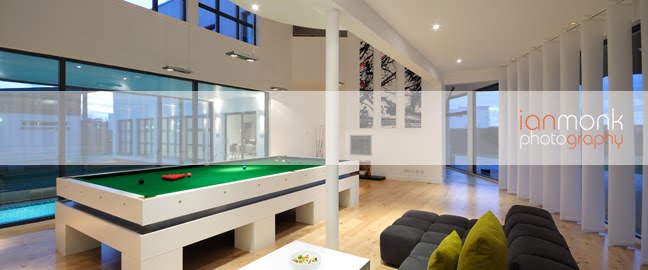
Actually, here's a couple of others from the shoot that I quite liked...


And this one which I actually really really like but I'm not sure anyone else will. Two versions...


And a black and white version...


I like the almost pastel colours of the colour but I also really like the grain and moodiness of the B&W. What do you think? Good, Indifferent, or crap? Would love to hear opinions!

Cheers
Ian :)


Tuesday 20 April 2010

Flashy Pad


I thought I would post up a few photos from a showhome I shot last week. The reason I'd like to post them is to show how I used a couple of flashes to even out the light in this livingroom. I always carry three flashes with me on every job but I don't always need them. If I'm shooting interiors I ideally like a nice cloudy day which will give me a softer light. If it's a sunny blue sky day it would give me shafts of light that are much much lighter than the rest of the interiors, basically far too much dynamic range for the camera.

I know a lot of people like to use HDR these days by bracketing between 3 and 9 shots and combining them in the computer, but that's not for me. I rarely see an HDR photo that I like and I'd MUCH rather know that I've got the shot before I leave the site rather than later on after half an hour on the computer looking at a picture that just doesn't look quite right!

There's a few things you can do to deal with these shafts of light such as pulling blinds down or even using a white sheet to cover the windows to soften the light a bit more, but if you have the windows in the shot then this isn't really going to work so well. Also, if the view is important for the shot then you really only have two options, light the room up to the same exposure value as the exterior ambient, or go the HDR route (you could take one exposure for the view and one for interior and mask in photoshop but to be honest, quite often just two frames like this don't sit well together.)

So anyway, on the shot above you can probably see a marked difference in the exposure of the upper and lower halves of the room. This was due to the angle of the sun coming in the window behind me. Also note that the lights are on. Some clients prefer to have internal lights on and some prefer them to be off. It's a matter of preference and it can even depend on the type of room you're shooting. If there are small spotlights then I'd usually prefer them to be on, especially if there's any reflective surfaces showing. I usually shoot between f11 and f16 which gives you a nice 'star/twinkle' effect from point light sources that add a little bit of extra interest in the frame. But for lights such as these I quite like them to be off so they don't burn in too much during the exposure. This also means the white balance is a lot more straight forward of course.

So I turned the lights off and took another shot to see how the shadows on the wall were affected...


I could see straight away that I would need to set up a couple of flashes to get a more even coverage. One option would of course to fix it in post production, but, as with the HDR, I'd much rather get the shot in the camera before I leave the site. Also, if I'm honest, it's also a bit of professional pride for me to get pictures as close to finished in camera as possible. I do of course post process all images but if you can do it in camera then I think you should.

Anyway, to even out the exposure I put two flashes fairly high up in the corners of the room behind me, both pointing into the corners with wide angle diffusers on. Pointing them into the corners gives a much more even coverage because it's making the light bounce off in all directions. This is really important to reduce shadows. One place I always look at when I'm looking at interior shots are the ceiling lights. You can usually tell where the dominant light is coming from by the shadow.

In the next shot you can see the coverage isn't quite even enough and so is giving me a bit too much of a harsh shadow on the ceiling light...


You can see two shadows from the flashes but you can also see that the shadow on the far wall has pretty much disappeared. This told me that the power of the lights was fine but that they needed to be backed off from the ceiling a bit. More distance means more coverage as they hit a wider area of the wall. This would fill in those shadows nicely. So I backed both off a bit (basically lowered the stands by about a foot) and shot again to get the final shot...


This might seem like a lot of effort to go to for a shot of a livingroom but it's details like this that make a difference. For the final delivered shot I also cloned the chair which has some of it's leather covering falling off (which I missed on the day!!) and tweaked the white balance a touch.

There is a nice even light in the room that I think makes it look clean, fresh and inviting and there's no harsh shadows to distract or draw the eye to. There's definitely a time and place for higher contrast looks but for most interior shots a nice bright, clean and fresh look is what is asked for.

Apologies for the longer post as it's probably a bit rambling but I get carried away easily :) Please leave a comment with any thoughts or hints for me or others, it's much appreciated.

Cheers
Ian :)


Monday 19 April 2010

Nice house and Scooby Doo too!


Just a few pictures from the weekend shoot. This was a lovely show house from David Wilson Homes in Dunfermline. The site is in the early stages so I had to do some extensive cloning on the picture above. In particular on the right side of the frame there was metal mesh fencing which was a challenge to remove :) And also the lower right window is basically a copy of the one above it since the fence went right in front of it. I've changed the reflection a bit so it's not that obvious but it was the best way to 'rebuild' the window.

I was a bit lucky with the weather too as it was a pretty cloudy morning but there was one patch of blue sky drifting slowly towards the right part of the sky for this shot. I had to wait about 10 minutes for this but it was worth it. Always better to get a nice sky in camera rather than having to replace it in post production in my opinion.

Anyway, the house was lovely and had a great kitchen...


Being an ex-chef I always like looking at new kitchens and this one was really spacious!

There was also a sales event on that day and we had the scooby doo van turn up for the kids for a while...


I took most pics of the house with natural light since it was quite cloudy so I had a soft enough light. I do have a 'Flashy pad' post to put up from a different job last week though so I'll be working on that over the next day or so.

Thanks for reading :)
Ian


Friday 16 April 2010

Lancers


I had the pleasure of taking some pictures for the newly refurbished Lancers restaurant in Edinburgh a few days ago. It's a very modern, stylish place with friendly staff and amazing food. As usual we were a bit time limited having to take interior, food and portrait shots, so we had to move to different lighting for each. I'm really happy with how they came out so I thought I'd share some here :)

The shot above was taken with a softbox cam left balanced with the ambient spotlights for the background.
The food shots below were mainly taken with natural light behind and a flash off to cam right.


And here's a nice wee outtake which I really like...


Hope you like these, if so leave a comment :)
I'll be updating more frequently from now on so check back here or my twitter for updates.

Cheers
Ian


Yes, yes it's an update!


Well it's been far too long since I updated the blog. I've spent the last couple of months concentrating on the business side of things which is a necessary evil :) I've decided to post up a couple of tear sheets that relate back to recent posts just to tie these up really. Above is a Double Page Spread opener for a beautiful new build house feature that we shot at the end of last year. I love the picture and I think it worked really well as a DPS opener.

The next picture is from the last Braehead Food School shoot we did. It's the full page opener to a recipes section.


I'm currently planning some new blog posts so keep an eye out for updates :)
On a related note, does anyone have any recommendations for offline blog editors for the mac? Coming from windows live writer to the built in blogger editor is really rubbish :)

Cheers
Ian